
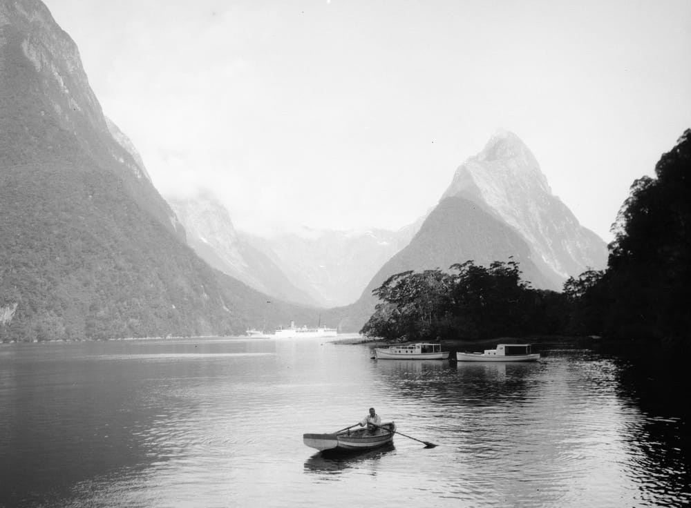
Color photography won. That much is settled. Every camera made today shoots in color by default, every platform is built around it, and the overwhelming majority of travel images published anywhere are saturated, warm-toned, and visually loud. Which is exactly why black and white still matters — and why Anthony Schiliro, a travel photographer whose work spans five continents, keeps coming back to it even when the color version of a scene is objectively beautiful.
This isn’t nostalgia. It isn’t a stylistic affectation or an attempt to make a mediocre photograph look more serious. It’s a deliberate choice about what you want a photograph to actually say.
What Color Takes Away
Color is information. A lot of it. When you look at a color photograph, your eye is immediately sorting and processing — registering the warmth of a sunset, the green of a market vegetable, the particular blue of a Mediterranean door. That processing is mostly involuntary, and it happens before you’ve had a chance to look at the actual subject of the image.
Black and white removes that layer and forces the eye somewhere else: toward light, shape, texture, and the relationship between elements in the frame. A face in monochrome is read differently than a face in color. The expression carries more weight. The eyes do more work. Stripping color from an image doesn’t make it simpler — it makes it more honest about what it’s actually about.
The Film Noir Connection
Anthony’s photographic instincts were shaped partly by cinema — specifically by the visual language of film noir and the work of directors like David Lynch and Stanley Kubrick, both of whom understood contrast and shadow as compositional tools rather than technical problems to solve. Film noir built entire emotional worlds out of the relationship between light and dark. What fell into shadow was as meaningful as what the light revealed.
That instinct translates directly to still photography. A street scene shot in full color reads as documentation. The same scene in black and white, with the exposure pulled to deepen the shadows and sharpen the contrast, reads as atmosphere. The difference isn’t just aesthetic — it changes what the viewer feels standing in front of the image.
When to Choose Monochrome
Not every photograph benefits from black and white, and applying it indiscriminately is its own kind of mistake. Color carries meaning — the saffron robes of a monk in Kyoto, the painted colonial facades of Old San Juan, the green-gold light of a Vietnamese market at dawn. Removing color from those images loses something essential.
Black and white earns its place when the subject is primarily about light, texture, or human expression rather than color itself. Architectural details. Portraits of strangers. Fog, rain, shadow. Scenes where the mood is the point and color would compete with it rather than support it. The question worth asking before converting any image is simple: does color add something here, or is it just there?
The Humanist Photography Tradition
The photographers who shaped humanist photography — Henri Cartier-Bresson, Dorothea Lange, Sebastião Salgado — worked predominantly in black and white not because color wasn’t available but because monochrome served their purposes better. They were photographing people, and they wanted the viewer present with the subject, undistracted by anything pulling attention away from the human being in the frame.
That tradition is worth continuing, even now. Black and white in travel photography isn’t a retreat from the modern world. It’s a specific claim about what matters in a given image — and a deliberate invitation to look at it differently than you look at everything else on your screen.
Leave a Reply